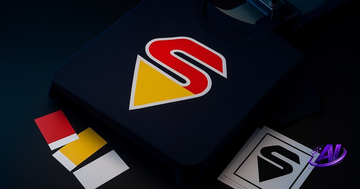
What Is Index Color Separation?
Index color separation is a screen-printing technique that assigns one screen to each solid spot color in a design—no halftone dots, no blending. If your art has five distinct colors, you print five screens of opaque ink, stacked in sequence. It's the go-to method for bold vector graphics: logos, text, geometric illustrations, and anything drawn with hard edges and flat fills.
Unlike simulated process (which uses halftone dots of four or more colors to fake full-color photos), index keeps each color pure and separate. You're matching Pantones or mixing custom spot inks, not building gradients out of CMYK dots. The result is vibrant, opaque coverage—especially on dark garments—with no dot gain to worry about and no mesh-count calculations for halftone LPI.
Index has been the backbone of screen printing since before desktop computers. It's still faster to set up, faster on press, and cheaper per shirt when your design has six colors or fewer and no photographic detail. Most one- to three-color jobs—team names, event tees, simple brand marks—are index all the way.
Index vs. Simulated Process: Which to Choose
The decision comes down to what the art looks like and what the customer expects. If you're looking at a photograph, a gradient sunset, or a design with dozens of shades blending together, you need simulated process—there's no way to print 47 spot colors economically. But if the file is a vector logo with four flat colors and crisp edges, index is faster, cleaner, and cheaper.
Use index separation when:
- The design has six or fewer distinct, solid colors
- Art is vector-based or drawn with flat fills (Illustrator files, text, geometric shapes)
- You need exact Pantone or corporate color matching
- The job is on dark garments and you want opaque, vibrant inks without worrying about underbase halftone gain
- Press time and setup cost matter—fewer screens, simpler registration, no flash between highlight white and process layers
Use simulated process when:
- The art is a photograph, has continuous-tone shading, or includes complex gradients
- There are more colors than you have press heads, or the palette is too large to mix economically
- You need to reproduce skin tones, realistic textures, or subtle color transitions
Sometimes a design sits in the middle—vector art with a gradient background, or a logo over a photo. In those cases you can hybrid-separate: index the logo layers, simulated process the background, and combine them in one print. Tools like AI color separation software can flag which parts of a file are candidates for each method, so you're not guessing in Photoshop.
How Index Separation Works (and Why Trapping Matters)
An index separation starts with isolating each color in the design onto its own layer or channel—one black-and-white bitmap per screen. In Photoshop, that might mean selecting by color range, creating alpha channels, and exporting each as a 1-bit TIFF. In Illustrator, you're already working in spot colors, so it's mostly a matter of breaking apart overlapping shapes and deciding print order.
The tricky part is trapping—also called choke and spread. Because screen printing is an off-contact process (the mesh lifts as the squeegee passes), registration between screens is never pixel-perfect. If two colors butt up against each other with no overlap, even a hairline shift on press will leave a white gap or dark garment showing through. To prevent that, you intentionally overlap the edges: spread the background color outward, or choke the foreground color inward, by 1–2 pixels at 300 dpi (roughly 0.5–1 point). The ink opacity hides the overlap, and any misregistration stays invisible.
Trapping by hand in Photoshop—stroking paths, expanding selections, layer math—eats time and invites mistakes. Automated tools handle it faster: they detect every color boundary, calculate who's darker, and apply the correct choke or spread in one pass. That's one reason standalone separation software exists—it's built for exactly this repetitive, error-prone step.
Common Index Separation Mistakes (and How to Avoid Them)
No trapping. The biggest rookie error. If you output each color as-is from Illustrator with no overlap, the first press run will show white slivers everywhere. Always trap, even on a tight-registration press—it's insurance.
Wrong print order. Lighter or more transparent inks should print first; darker, opaque inks last. If you print black first and yellow second, the yellow will look muddy. Decide your sequence during separation, and mark each screen clearly.
Trying to index a gradient. You'll end up with banding—visible steps instead of a smooth transition—because you're reducing continuous tone to a handful of flat colors. If the gradient is small (a logo accent), sometimes you can live with three or four banded steps. If it's a large background, switch to simulated process or use a single-color halftone screen for that element.
Ignoring underbase on dark shirts. Even with opaque plastisol, bright colors (yellow, orange, red) can look dull on black fabric without a white underbase. For index jobs on darks, print white first under any color that needs pop, then follow with your spot colors. It adds a screen, but the vibrancy is worth it.
Index Separation for DTF
Direct-to-film printers use CMYK+White in a single pass, so traditional index separation—one screen per spot color—doesn't translate directly. But the logic of index still applies when you're printing bold vector art on a DTF system: you want solid color fills, minimal blending, and a clean white layer that matches the design's opaque areas, not a full-bleed underbase rectangle.
Some RIP software lets you replace process colors with spot-color recipes (so red prints as 100 % magenta + 100 % yellow instead of a halftone mix), which keeps edges crisp and colors vibrant. You'll also want to mask the white layer tightly to the artwork—DTF adhesive powder on excess white creates a stiff, plasticky feel and visible edges. If your design is a three-color logo, your white layer should follow that logo's outline, not fill the whole transfer sheet.
AI Separations' Print Doctor flags designs that are trying to halftone-blend what should be solid vector colors on DTF, and warns when white-layer bleed will leave powder residue. It's a different press technology, but the prepress principle is the same: know when your art should be treated as flat color versus continuous tone.
Speeding Up Index Separation with AI Tools
Manual index separation—select, expand, contract, trap, export—can take twenty minutes for a four-color design, longer if you're troubleshooting Photoshop layer masks or fixing bad vector art in Illustrator. AI color separation software compresses that workflow: drop in the file, pick "spot color" or "index," and the engine identifies each color, builds the separations, applies trapping, and outputs print-ready positives in under a minute.
AI Separations handles index, simulated process, and hybrid jobs in one standalone app—no Photoshop license required. It detects when a design is a good candidate for index (hard edges, limited palette) versus sim-process (photos, gradients), applies choke/spread automatically, and previews each screen so you can confirm print order before output. The Print Doctor check also flags resolution problems, too-thin strokes that'll drop out on a 156 mesh, and underbase gaps—catching prepress mistakes before they cost you a screen and press time.
For shops running dozens of jobs a week, the time savings add up fast. And because it's a one-time $179 purchase instead of a monthly subscription, the ROI hits after about ten jobs. You still have full control—adjust trap width, reorder screens, tweak colors—but the grunt work is automated.
Ready to separate faster and stop guessing on trapping? Download the free trial at aiseparations.com—no Photoshop required, and you'll keep the standalone app forever for $179 one-time.
Frequently asked questions
What is index color separation?
Index color separation is a screen-printing method that assigns one solid spot-color screen to each distinct color in a design, with no halftone dots—ideal for logos, text, and vector graphics with hard edges and flat fills.
Is index separation better than simulated process?
Index separation is better for vector art with six or fewer solid colors and when exact color matching matters; simulated process is better for photographs, gradients, and designs with complex shading or more colors than your press can handle economically.
Do I need to trap index separations?
Yes—trapping (choke/spread) is essential for index separations because even slight press misregistration will leave white gaps between colors if edges don't overlap by 1–2 pixels at 300 dpi.
Can you use index separation on dark garments?
Yes, index separation works well on dark garments, but you'll need a white underbase screen under any bright or transparent spot colors (yellow, orange, red) to keep them vibrant and opaque.
How many colors can you print with index separation?
You can print as many index colors as your press has heads and your budget allows for screens and setup, but most shops find index economical and practical for designs with six or fewer distinct spot colors.
Try it on your own artwork
AI Separations is a standalone prepress & quoting studio for screen printing & DTF — AI color separation, an instant quote, a print-readiness check, and ink matching. No Photoshop, $179 one-time, free trial.