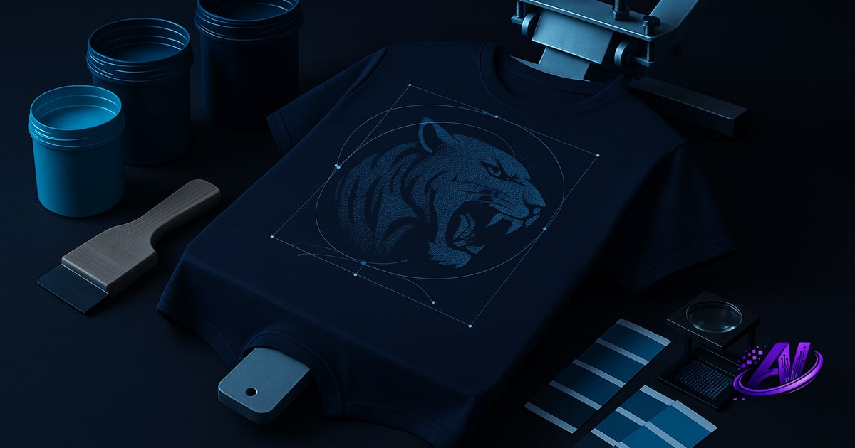
Vector vs Raster: What's the Difference (and Why Printers Care)
Vector files (AI, EPS, PDF, SVG) store artwork as mathematical paths—curves, anchor points, fills. Scale them to billboard size or thumbnail and the edges stay crisp. Raster files (PNG, JPEG, PSD, TIFF) are grids of pixels. Zoom past 100% and you see squares.
Screen printers care because vector art separates cleanly into spot colors with hard edges—no anti-aliasing fuzz, no halftone dots unless you want them. A two-color logo in vector yields two films, two screens, perfect registration. The same logo as a low-res PNG might need trapping, underbase expansion, or a full simulated-process separation just to hide pixelation.
Raster files aren't bad—they're necessary for photographic images, gradients, and anything that didn't start in Illustrator. But resolution, color mode, and layer structure matter more than file extension. A 72 DPI PNG is a problem. A 300 DPI layered PSD at print size is production-ready.
The Best File Formats for Screen Printing (Ranked)
Here's the pecking order, from a separator's desk:
- AI (Adobe Illustrator) — Native vector format. Editable paths, spot colors, text on outlines. If you have this, send it.
- EPS or PDF — Universal vector exchange. Embed fonts, keep spot colors named (not converted to process). PDF from Illustrator is fine; PDF exported from Word is usually rasterized garbage.
- PSD (Photoshop) — Layered raster at 300+ DPI, RGB or CMYK, print size. Ideal for simulated process or DTF. Don't flatten unless the printer asks.
- PNG (high-res, transparent background) — Lossless raster. At 300 DPI and actual print dimensions, perfectly usable. Watch out for flattened layers and lost color channels.
- TIFF — Archival raster, supports layers and high bit-depth. Rarely seen from customers, but separators love it.
- SVG — Web vector format. Works, but may have embedded raster effects or unsupported features. Export to PDF first.
- JPEG — Lossy compression = color banding, artifacts around text, no transparency. Use only when nothing else exists, and crank quality to 100%.
If you're a customer sending a file, AI or high-res PNG covers 95% of jobs. If you're a shop receiving files, set a minimum spec: vector or 300 DPI raster at print size, RGB, layers if available.
Resolution and Size: How Big Is Big Enough?
300 DPI at final print size is the industry standard for raster artwork. Printing a 12˝ × 16˝ image? You need 3,600 × 4,800 pixels. Anything lower and halftone dots can't resolve fine detail, or you'll see pixelation through the mesh.
Higher is fine—600 DPI gives headroom for underbase traps and tight halftone screens—but past that you're just bloating file size. Lower than 300 DPI and you're gambling: 200 DPI might survive on a dark shirt with 55 LPI halftones, but it won't pass a print readiness check for white polyester or DTF.
Vector files ignore DPI entirely. An Illustrator logo at 2˝ wide scales to 20˝ with zero quality loss. That's why printers prefer vector for text, logos, and hard-edge graphics—no resolution math, no interpolation artifacts.
If a customer sends a 600-pixel-wide PNG and asks for a full back print, you have three options: reject it, redraw it in vector, or upsample and warn them the result will look soft. A quick resolution check up front saves a re-send or a chargeback.
Color Mode: RGB, CMYK, Spot, or Pantone?
Most customers send RGB files—it's the default in every phone, camera, and web export. That's fine. Screen printers and separators convert to the target color space during sep work. Forcing a customer to "convert to CMYK" before sending often makes things worse: they'll use the wrong ICC profile, crush the gamut, or flatten transparency.
Spot color files (Pantone swatches in Illustrator, named channels in Photoshop) are gold if you're printing hard colors or need exact ink matching. A two-color vector file with PMS 186 and black tells the separator exactly what you want. A flattened JPEG of the same design forces them to guess.
For simulated process (full-color photographic prints), RGB rasters separate cleaner than pre-converted CMYK—separation software builds custom ink recipes per job, not generic four-color process. For DTF, RGB + white channel is standard; the RIP handles CMYK conversion and white underbase in one pass.
Bottom line: send files in their native color space with layers and swatches intact. Let the separator or RIP do the conversion with the right profiles and underbase logic.
Does Artwork Have to Be Vector for Screen Printing?
No. Photorealistic designs, gradients, watercolor effects, and anything with continuous tone must be raster—vector can't represent them. Simulated-process separations turn those rasters into halftone screens (typically four to seven colors), each printed as a pattern of dots that optically blend on the shirt.
Vector is preferred for logos, text, stripes, hard-edge illustrations—anything that should print as a solid ink film with crisp edges. But even simple designs sometimes mix both: a vector logo with a raster photo background, or text over a gradient. The separator handles each element appropriately.
The confusion comes from old-school advice: "screen printing is spot color, so you need vector." That was true when every job was two or three Pantone inks. Modern simulated process, CMYK wet-on-wet, and DTF handle full-color raster images beautifully—if the resolution and color separation are dialed in.
The real question isn't vector-or-raster. It's: Is the file high enough resolution, properly color-managed, and structured so a separator can build clean films? A 72 DPI vector logo with rasterized drop shadows fails that test. A 400 DPI layered PSD passes it.
Common File-Prep Mistakes (and How to Fix Them)
Flattened layers. Merging everything into one layer bakes in backgrounds, anti-aliasing, and blending modes. The separator can't isolate the design, rebuild the underbase, or swap colors without re-creating the art. Keep layers; let the printer flatten if needed.
Upsized low-res images. Doubling the pixel dimensions in Photoshop doesn't add detail—it just interpolates blur. If the source is 150 DPI, redraw it in vector or find a higher-res original. AI upscaling (Gigapixel, Topaz) helps in a pinch, but it's not magic.
Converted-to-outlines text with no editable copy. Once text becomes paths, you can't fix typos or swap fonts without starting over. Send both: live text in one layer, outlined fallback in another, or include the font files.
Wrong color space with embedded profiles. A customer exports CMYK using a glossy-magazine profile, and the separator opens it with a screen-print profile—colors shift. Stick to RGB or spot; let the pro handle conversion.
No bleed or safety margin. Design edge-to-edge with critical text? It'll crop or misregister. Add 0.125˝ bleed outside the cut line and keep live area 0.25˝ inside.
A print readiness check flags most of these before they hit the press—low resolution, too many colors, missing underbase, banding gradients, DTF glue-residue risk. Catch them at file-prep, not at invoice time.
What to Send Your Printer (The Checklist)
When you hand off a file—whether you're a customer or passing art to your separator—include:
- Vector source (AI, EPS, PDF) if the design is logo/text/illustration, or
- High-res raster (PSD, PNG, TIFF) at 300+ DPI, print size for photos and complex art
- Layers intact (especially transparency, spot-color channels, text layers)
- RGB color mode unless you've been given a specific spot-color palette or Pantone list
- Fonts outlined or included (if vector)
- Print dimensions, placement notes, and ink-color preferences (e.g., "white underbase," "no highlight white," "match PMS 289")
- Substrate and print method (dark/light shirt, cotton/poly, screen or DTF)—it changes underbase and trapping strategy
If you're the printer and the customer sends a 900 KB JPEG with "make it look good," send back this checklist. You'll save three rounds of revisions and a Reddit post about why their photo looks pixelated.
AI Separations runs every file through an automated Print Doctor check: resolution, color count, banding, underbase need, screen-vs-DTF suitability. It flags problems in seconds, so you know whether to approve the file or ask for a better one—before you quote the job or burn a single screen.
Frequently asked questions
What file format is best for screen printing?
AI, EPS, or PDF for vector artwork (logos, text, hard-edge graphics) and high-resolution PSD or PNG (300 DPI at print size) for photographic or complex raster images are best for screen printing. Vector files scale infinitely and separate into clean spot colors, while high-res rasters are necessary for full-color simulated process or photorealistic designs.
Does artwork have to be vector for screen printing?
No, artwork does not have to be vector for screen printing. Photorealistic designs, gradients, and complex imagery require high-resolution raster files (300+ DPI), which are separated into halftone screens for simulated-process printing. Vector is preferred for logos and text because it produces crisp edges and scales without quality loss, but both formats are widely used depending on the design.
What resolution should my file be for screen printing?
Raster files should be at least 300 DPI at the final print size. For example, a 12-inch design requires 3,600 pixels across. Lower resolution risks visible pixelation or poor halftone detail, while vector files have no DPI requirement because they scale infinitely.
Should I send RGB or CMYK files to my screen printer?
Send RGB files with layers intact unless your printer specifies otherwise. Screen printers and separation software convert to the correct color space (spot, CMYK, or custom ink sets) using proper profiles and underbase logic. Pre-converting to CMYK with the wrong profile often crushes color and flattens transparency.
Can I use a PNG file for screen printing?
Yes, as long as the PNG is high resolution (300+ DPI at print size) and preferably has a transparent background. PNGs are lossless and work well for both spot-color and simulated-process separations, though layered PSD files give the separator more control over underbase and color channels.
Try it on your own artwork
AI Separations is a standalone prepress & quoting studio for screen printing & DTF — AI color separation, an instant quote, a print-readiness check, and ink matching. No Photoshop, $179 one-time, free trial.